Commercial Office Interior Design: Biggest Mistakes Owners Make
It’s 2:14 a.m. in the freight elevator of a hotel in Shenzhen. I’m holding a swatch of cashmere wall-covering in one hand, a cup of jasmine tea in the other, and I’m trying to explain to an exhausted carpenter why millimetres matter. A senior brand executive from New York steps in, sees the circles under my eyes, and whispers, “Zoe, does anyone really notice a two-millimetre reveal?”
I smile – slightly feral at that hour – and tell him the truth: the space will notice. Spaces have memories. They remember every compromise, every shortcut, every moment the narrative got watered down because someone was tired or scared or counting pennies in the wrong column. And later – whether it’s an opulent hotel lobby or a lean Toronto loft – people read those memories. They feel them the way you can feel tension in a room even when no one is speaking.
That night, we kept the reveal. Weeks later, the hotel’s opening night drew a line of guests who ran their fingertips along that very seam, marvelling at how the light kissed it. Two millimetres. Monumental difference.
I start here because each of the biggest commercial office interior design mistakes we’re about to explore lives in those millimetres – literal and metaphorical. You already know the stakes: the office you build is a physical promise to your staff, your investors, and your market. Break that promise, and no marketing plan can save you. Honor it, and the space itself becomes an engine of growth.
Mistake #1: Entering Without a Narrative Spine.
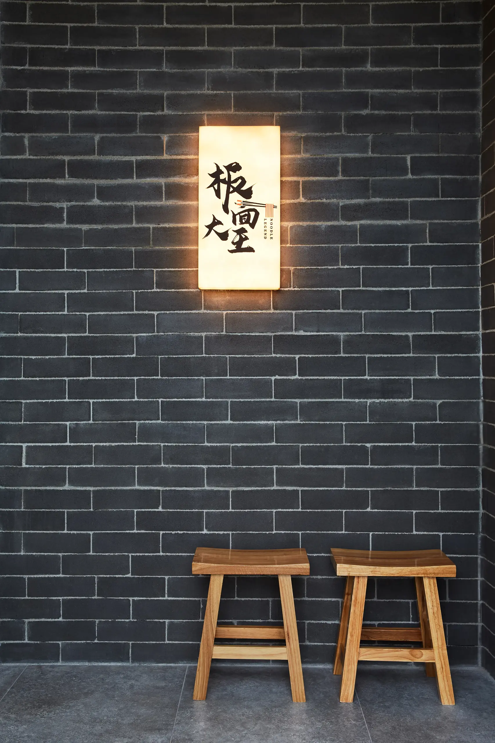
A commercial space starts telling the truth about you the second the door handle meets a palm. That moment is the threshold – and it’s where the first two mistakes usually erupt.
Many offices open like cheap paperbacks: flimsy covers, no plot. Reception desks float in a sea of beige. The logo glows, but dimly – disconnected from everything around it. Employees shrug, clients think, I’ve seen this movie, and the brand promise evaporates before the first handshake.
Solution
Think like a novelist: every novel needs an inciting incident. In design, that incident is your brand narrative. At Dexign Matter we run a narrative mapping workshop – music, mood boards, even a bit of theatre – until the story’s heartbeat surfaces. Only then do we sketch.
Ask yourself now: what single, visceral sentence captures your brand? If you can’t answer, neither can your space.
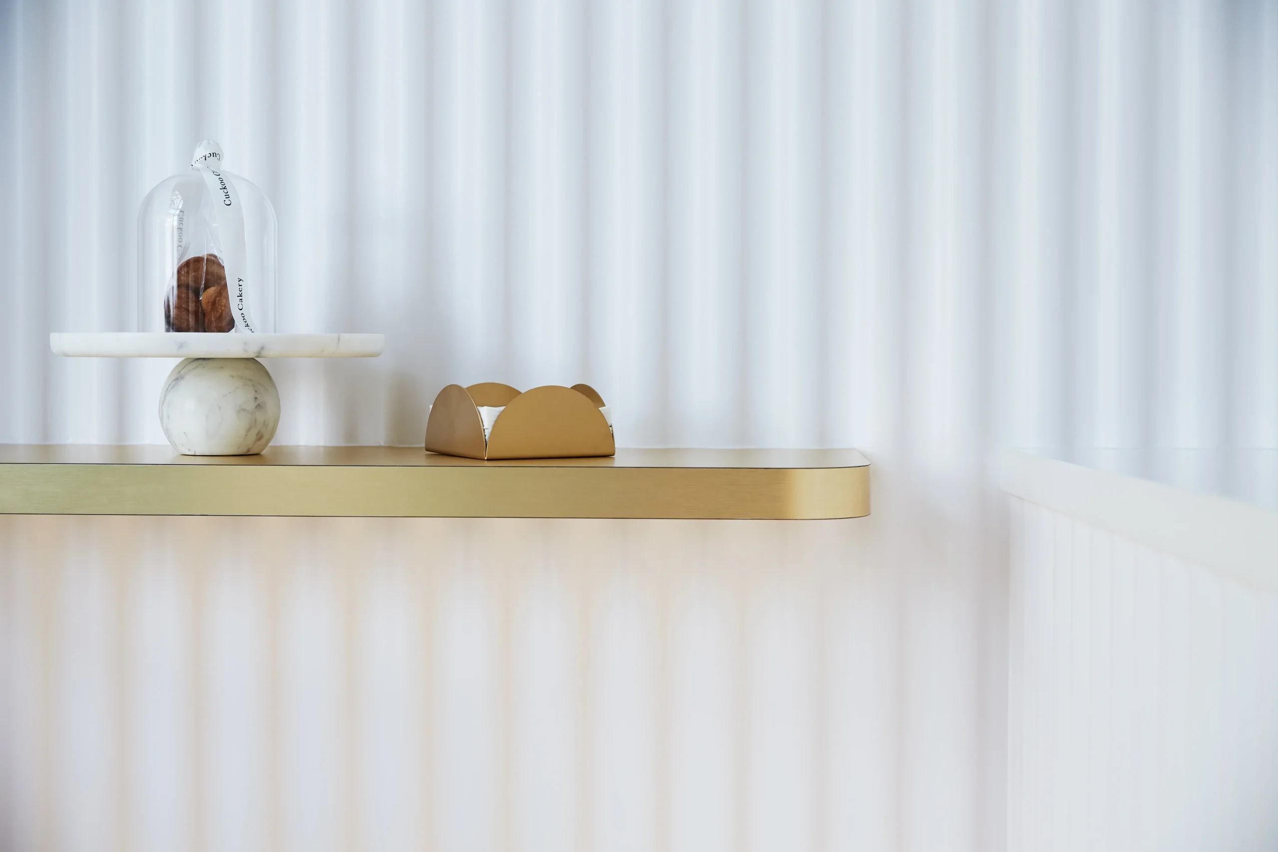
Mistake #2: Treating Reception as a Fancy Speed Bump.
Because the reception area rarely produces immediate revenue, owners under-invest, turning it into a perfunctory checkpoint – name, badge, straight ahead. Energy sinks before it even has a chance to rise.
Solution
Remember Shanghai’s traditional hu-tong courtyards – narrow alleys that suddenly open into gardens? Reception can do the same: compress, then release.
Treat that compression as choreography: slow people down, reduce visual clutter, and concentrate attention on a single framed view. Then allow a generous, breathable space for seating, transactions and social moments so arrival becomes both dramatic and entirely functional.
Interior Design Perfected
Mistake #3: Designing in Isolation from Daily Rituals.
The threshold is conviction. the core is credibility. This is where the next four mistakes lurk, often disguised as “best practices.”
Headcount spreadsheets rule the day. Actual human rituals – stretching after Zoom marathons, gossiping by the espresso machine, doodling big ideas on walls – get ignored. The office becomes a rigid tool, not a living organism.
Solution
Observe like an anthropologist. I shadow teams, note coffee-cup super-highways, chart soundscapes.
At one of the salons we noticed stylists spinning 180° between color mixing and rinse basins. We embedded turntables into cabinetry – now they glide, not pivot, saving micro-seconds that add up to an extra appointment per chair each day.
For your office, document one normal Tuesday hour by hour. The friction points you locate will guide wall shifts, furniture selection, even light temperature. Ritual-centred space planning isn’t decoration. it’s operational strategy.
Mistake #4: Inflating "Openness" into Acoustic Chaos.
WeWork-style benching looks efficient on a PDF. In reality, the constant hum erodes deep-work focus and escalates cortisol. The very collaboration you hoped to spark dies in a swarm of noise-cancelling headphones.
Solution
Treat sound as topography. Hills of hush, valleys of buzz. We layer absorptive felt clouds above focus zones, insert “acoustic alcoves” at 20-metre intervals, and publish an explicit sound code: red zones (library), amber (conversation), green (collaboration).
Mistake #5: Mistaking Trend for Timelessness.
You fall for mauve velvet banquettes because Instagram says so. Twelve months later, mauve is mauve-ing on, and your space looks like last season’s phone case. Worse, you’re stuck with custom furniture no upholsterer wants to touch.
Solution
I like to anchor 80% of a palette in what I call perpetual neutrals – materials whose legitimacy was proven long before hashtags existed: walnut, honed travertine, blackened steel. Then I devote 20% to “seasonal garnish” – paint-grade millwork, accent rugs – easily swapped as culture evolves.
This is not caution. It’s choreography. Classics hold the rhythm, accents improvise the dance.
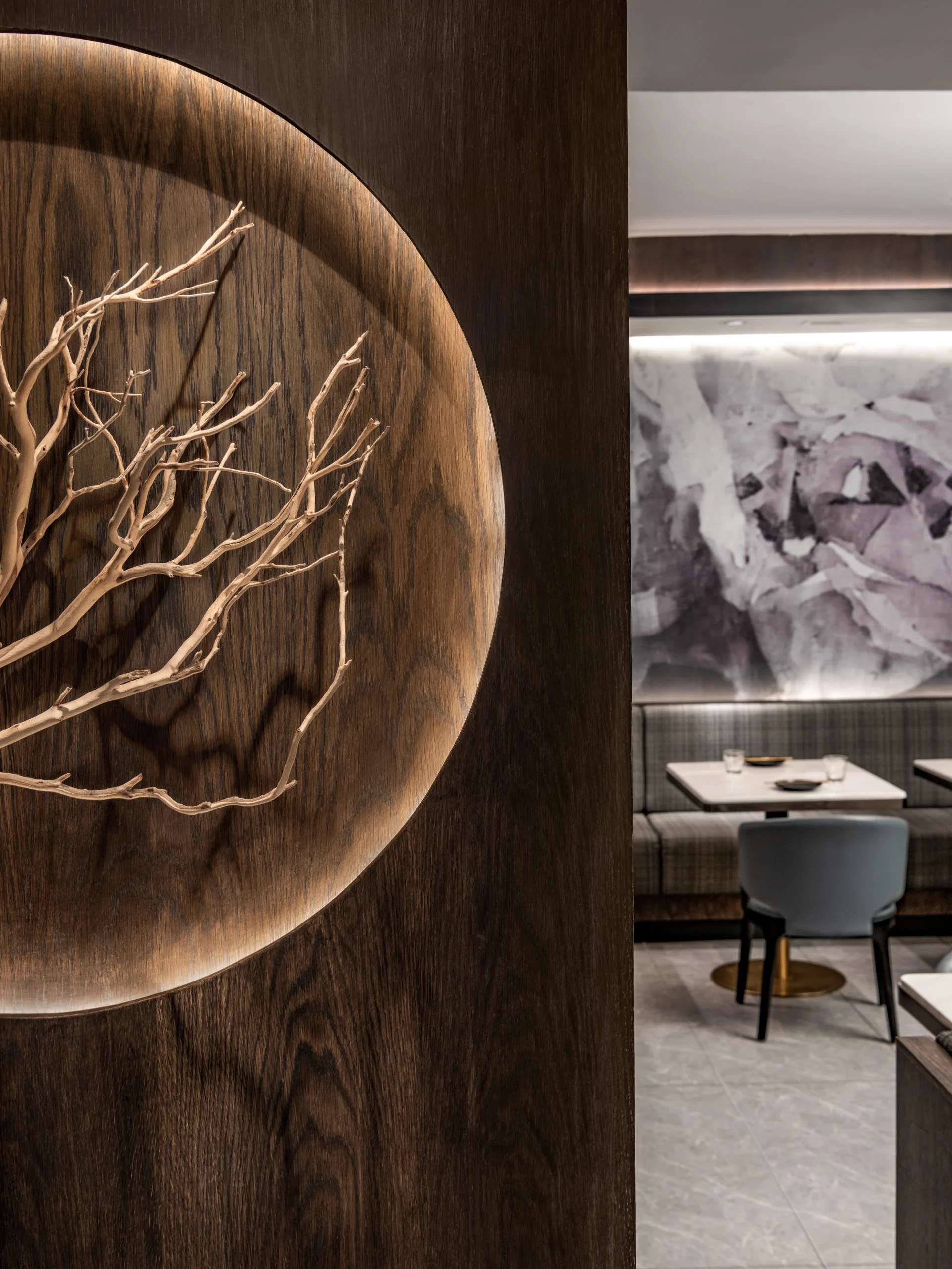
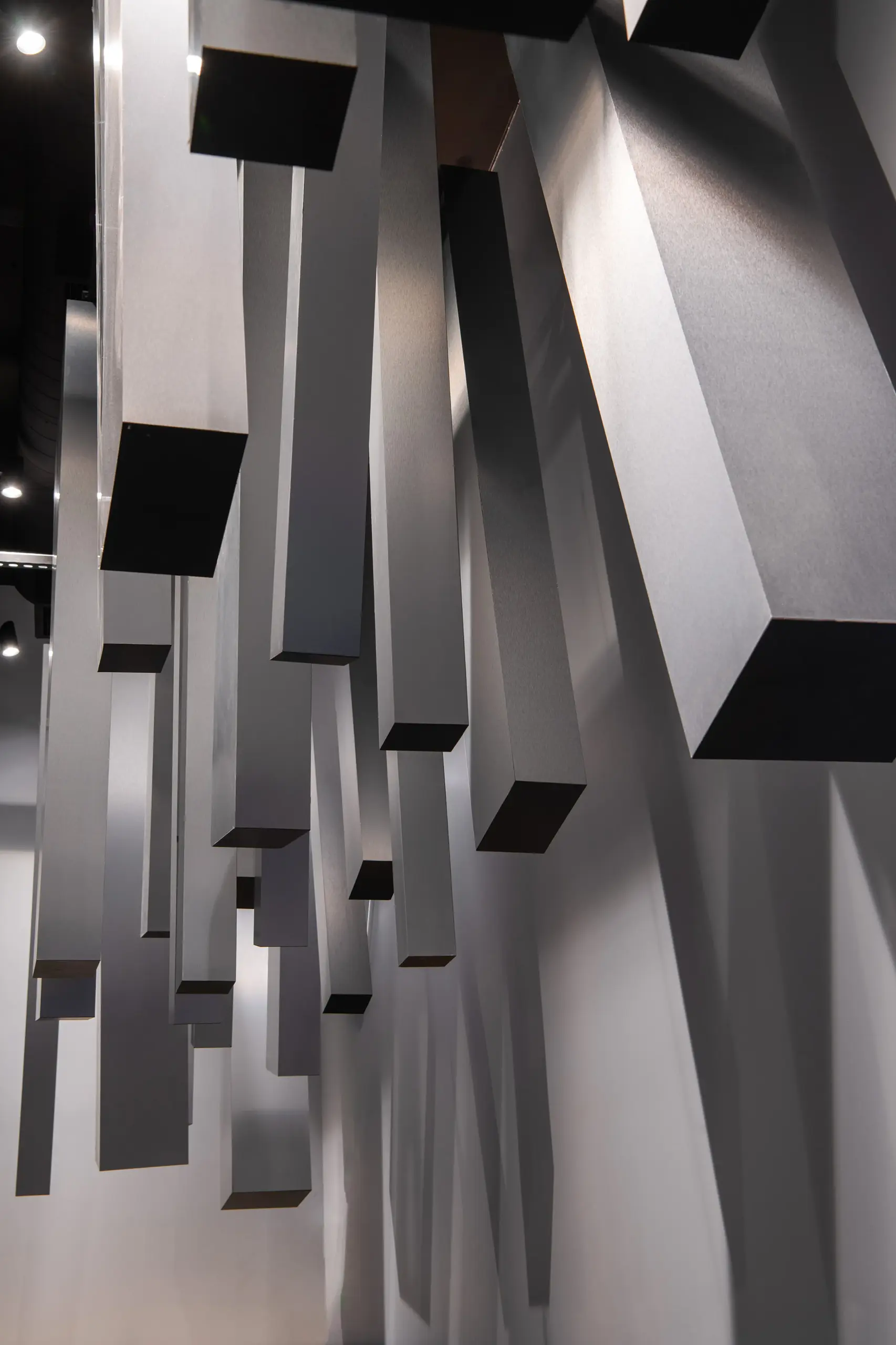
Mistake #6: Forgetting the Fifth Wall - The Ceiling.
Budgets get tight. Ceiling plans disappear into the dreaded white acoustic tile grid: a cost-driven neutral that flattens intention, scatters light unevenly, exposes sprinkler heads like industrial jewelry, and reduces photography to passport pictures.
Solution
The ceiling sets mood, controls acoustics, and completes a brand narrative.
Thoughtful interventions – painting the tiles a warm tone, introducing linear lighting, masking services with shallow soffits or acoustic clouds – can be economical and transformational.
Treat ceilings as emotional altitude.
Mistake #7: Treating Well-Being as a Buzzword.
A space only meets its dividend when bodies occupy it for eight hours straight. Comfort, health, and what I call microscopic delight anchor the next trio of mistakes.
A moss wall goes up, the marketing brochure says “biophilic,” and everyone moves on – ignoring glare, dry air, stale scent. Staff count the minutes to get outside because inside feels anaemic.
Solution
Design like a sommelier of the senses:
- Sight – Daylight first. artificial light second. decorative last. We map sun angles, bounce them off matte plaster to avoid retina burn, then layer tunable LEDs that warm as afternoon transitions to evening.
- Sound – Porous fabrics at ear height, diffusive panels overhead. The goal is 45 dB in focus areas – conversation without confession.
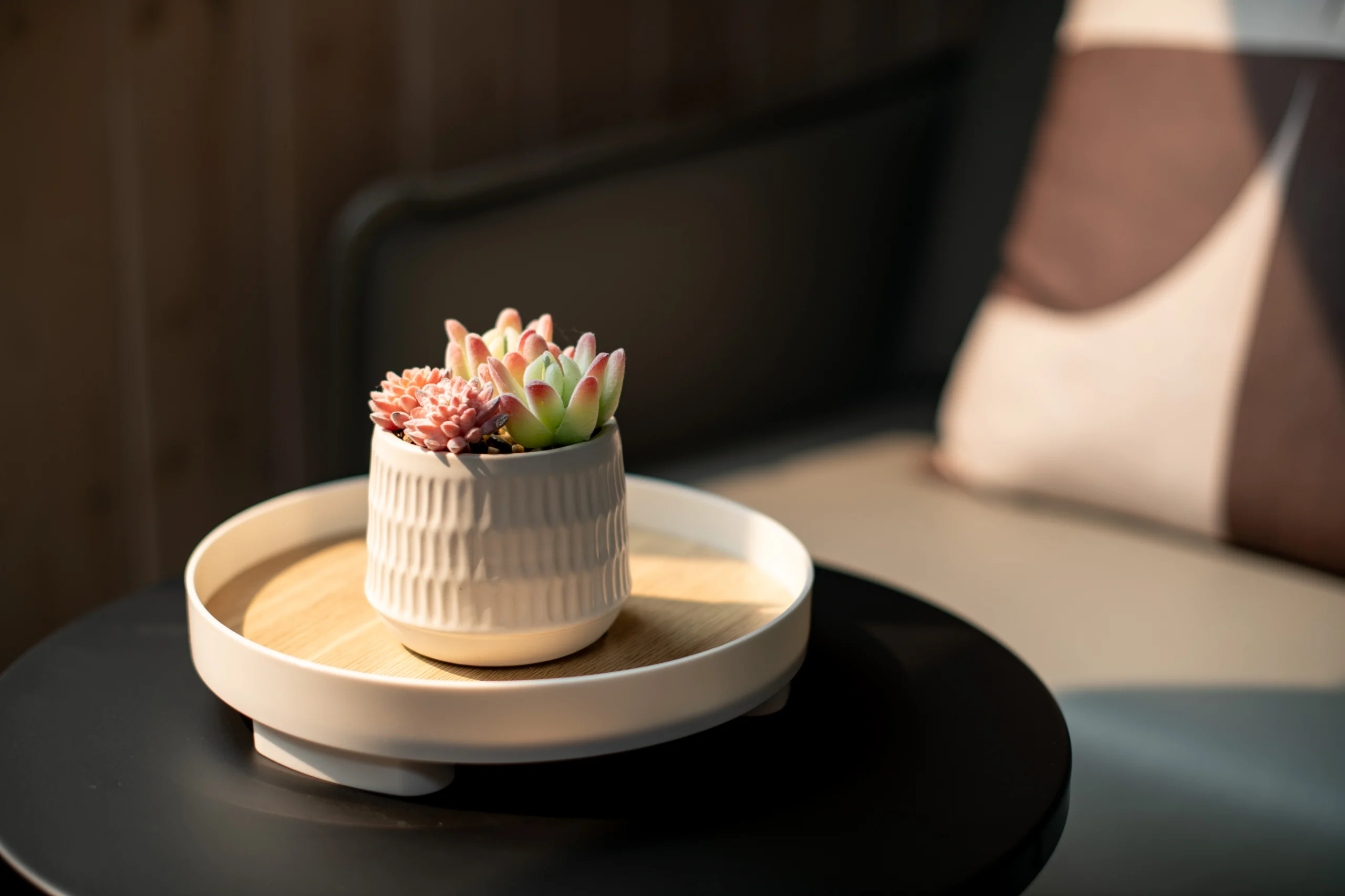
- Scent – Low-VOC everything, plus signature fragrance. A Toronto fintech picked white cedar and bergamot. Staff say it smells like “clarity.”
- Touch – Temperature and texture. Cool leather armrests in boardrooms (alertness), wool boucle in lounges (relaxation).
- Taste – Yes, taste. A micro-market stocked with citrus-infused water and nutrient-dense snacks sends a message: your body fuels your brain.
When the five senses tune in harmony, absenteeism drops.
Stay Informed on Interior Design Trends
Get our interior design insights right in your inbox.
Mistake #8: Designing Desks but Forgetting Devices.
People plug in where outlets exist, not where focus lives. Cables snake, batteries die, and the so-called agile office becomes a power-cord jungle.
Solution
Map a digital nervous system. Place flush-mounted USB-C and power/data combinations in table edges and bar counters so people plug in where focus lives, not in the nearest wall.
Integrate wireless charging plates into communal surfaces and route flex conduits under raised floors or within modular floor boxes for tidy cable runs.
Centralize IT closets to shorten runs and reduce signal loss.
Plan for capacity, redundancy and accessible service points. Wiring thoughtfully at build stage is far cheaper than chasing cables around blind corners later.
Mistake #9: Over-Curating Furniture, Under-Curating Movement.
The furniture collection looks like a design-week catalogue. Beautiful, still static. Employees twist, perch, lounge in unnatural contortions because the real world requires micro-adjustments.
Solution
Furniture is choreography in slow motion. Specify three postural typologies per team zone: vertical (task), reclined (think), perch (huddle). Vary seat depth, table height, and softness. Flexible, task-based ergonomics let people choose the posture that best supports their work, boosting endurance and sustained performance.
One of my clients sent me a Slack message three months post-move: “Zoe, I haven’t booked a massage since we moved!”
Mistake #10: Designing for Headcount, Not Business Models.
Your company will pivot, acquire, divest, perhaps even spin off a skunkworks division you can’t imagine today. Two more mistakes determine whether the space flexes with you or strangles you.
You fit 120 people into 10,000 sq ft today, and you’ll outgrow it tomorrow. Acquisitions, hybrid schedules, new departments – none of it fits the static plan. Rent double, or worse, move.
Solution
Invest in infrastructure elasticity: raised access floors, modular MEP cores, demountable partitions. These are structural decisions that let your plan adapt.
- Raised floors keep power, data and HVAC distribution accessible so you can relocate workstations or add server racks without destructive demolition.
- Modular MEP cores cluster mechanical, electrical and plumbing services into predictable zones so you can splice in new departments or plug in a tenant without rewiring half the floor.
- Demountable partitions give you true agility: reconfigure teams, create collaboration hubs or carve off leasable suites in days rather than months.
Taken together, these investments turn expensive, immovable architecture into a flexible operating asset that supports growth, acquisitions and hybrid models with minimal downtime and real cost savings over time.
Closing Reflections
When I was 16, I drew my first floor plan on cheap tracing paper. My teacher said, “Good, but where’s the music?” I didn’t understand then. I do now. Every built environment is choreography – rhythm, pause, crescendo, hush. Get the rhythm wrong and the dancers stumble. Get it right, and the walls sing, the floors glide, the ceilings soar.
If you’re reading this because you’re about to sign a lease, or you’ve stared too long at cubicles that feel like Monday personified, know this: mistakes aren’t monsters under the bed. They’re raw material. Shape them with narrative, sensory intelligence, and pragmatic craft, and they become the very textures that make your story unforgettable.
That is the essence of Dexign Matter’s promise: a design that embodies your brand, celebrates culture and artistry, and turns square footage into strategic leverage. If that resonates – if you can already taste the cedar-bergamot in your lobby or feel the hush of a perfectly tuned acoustic cloud – let’s talk. I’ll brew fresh jasmine tea (hot this time), spread out the tracing paper, and listen. Together we’ll guard those two-millimetre reveals, because they’re never just reveals. they’re respect, pride, and future revenue – all folded into a seam you can run your finger along.
Frequently Asked Questions
How is the budget for a commercial office interior design project typically structured?
A budget covers design fees, furniture (FF&E), construction, and contingency. Investing in a detailed design phase is crucial, as it mitigates expensive rework later, which can consume 5–10% of total project costs, protecting your overall investment.
What's a realistic timeline for a high-impact commercial office interior design project?
A comprehensive project typically ranges from 6 to 18+ months. This includes strategy and conceptual design (2-4 months), detailed design and documentation (3-6 months), and construction (4-8+ months). The final timeline depends on project scale, complexity, and approval processes.
How do you translate an abstract brand story into tangible commercial office interior design elements?
We use a narrative mapping process to distill your brand's essence into a sensory palette. This story then informs every choice - from the texture of a wall finish and quality of light to custom millwork and acoustic strategy - ensuring the space is a physical embodiment of your unique vision.
Beyond aesthetics, what are the key metrics for measuring the ROI of commercial office interior design?
Key ROI metrics include improved employee productivity, higher talent retention, and reduced absenteeism. Enhancing air quality alone can yield an 11% gain in productivity. We also track brand equity through press features, turning your space into a measurable business asset.
How does sustainable design contribute to a premium commercial office's brand and value?
Sustainable design enhances brand reputation and directly impacts employee well-being. Using low-VOC materials and maximizing daylight creates a healthier environment. In fact, offices lacking daylight are linked to about 10% of employee sick days, making wellness a tangible investment.
How can a well-executed commercial office interior design directly impact employee retention?
An exceptional workplace is a powerful tool for retention that signals company culture and value. Great design fosters pride and well-being, significantly boosting loyalty. Studies show employees in top-tier environments are nearly 3× more likely to remain with their company.
What are the key phases of working with a design studio on a commercial office project?
The process unfolds in distinct phases:
- Strategic Discovery to define goals
- Conceptual & Schematic Design to establish the vision.
- Design Development & Documentation for technical specifics.
- Construction Administration to ensure flawless execution through to final installation.
How do you balance iconic 'wow-factor' moments with everyday functionality in an office design?
We anchor the design in a highly functional, ergonomic foundation based on daily workflows. The 'wow-factor' is then strategically layered in key areas - like reception or social hubs - to amplify the brand narrative without ever compromising the core productivity and comfort of the working environment.
What level of involvement is expected from me as the client during the design process?
Your primary involvement is during the initial strategic phase to set the vision and at key milestone presentations for decisive feedback. Our role is to translate your vision and manage the complex details, allowing you to remain focused on your business while we ensure the project aligns perfectly with your goals.